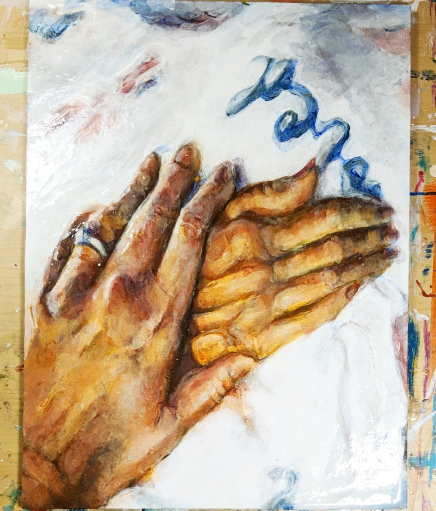
This painting is dedicated to my grandmother. She was one of the most important women in my life and it was a serious blow to lose her. It’s based off of one of the last pictures taken of her with my mom. It’s no secret I’m obsessed with hands so I found the photo incredibly beautiful and moving to me. Highly in character for my grandmother, she asked my mom to paint her nails before going into the hospital. The blanket on her was gifted by a nurse at the hospital who adored my grandmother because she’d talk the nurse’s ear off every day. Painting this was therapeutic and in a way helped me mourn, though I guess you’d be over just about anything if you studied over it for 7 hours.
With the personal background behind us, lets talk about the process and what I learned!
The Palette:
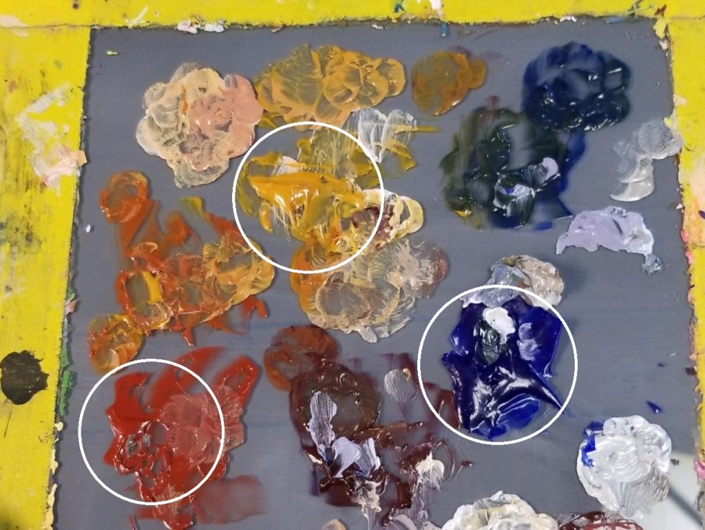
Before I started this picture, I chose 3 paints to use for the entirety of the piece. Those were Red Iron Oxide, Spanish Gold Ochre, and Ultramarine Blue. These were later supplemented with Brown Iron Oxide and Titanium/Zinc White. The reason why I decided to use these colors is because I associate them with this time in my life as they were the first 3 paints I have ever made (yes, I make all my own paints; I can explain the process in a later blog post but it’s too much to go over here) as well as the only ones I had the opportunity to show my grandmother while she was still alive. They create a gorgeous warm gamut with the Red/Brown Iron Oxide and Spanish Gold Ochre being inorganic/mineral pigments, meaning they are naturally occurring pigments which are taken from the earth or created from natural ingredients. Ultramarine Blue on the other hand is synthetically produced and considered an organic pigment. There’s close to no naturally occurring blues so it’s the next best thing considering it’s a warm leaning blue compared to its contemporaries.
If you’re already familiar with traditional painting, you might ask, “what the heck is Spanish Gold Ochre” which is a valid question because it’s not a color you traditionally see from paint manufactures. I made this paint using pigment PY42H which I bought from Kama Pigments. It’s basically just a variant of Yellow Ochre with a cleaner and more saturated color which leans more towards a mustard yellow than the usual Yellow Ochre’s dull brown.
Though I am happy with the result, if I had to do anything differently next time I might’ve swapped out the two inorganic pigments as they’re naturally opaque colors and required a lot of medium to give clean glazes. Speaking of which-
How the Glaze is Made:
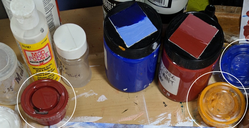
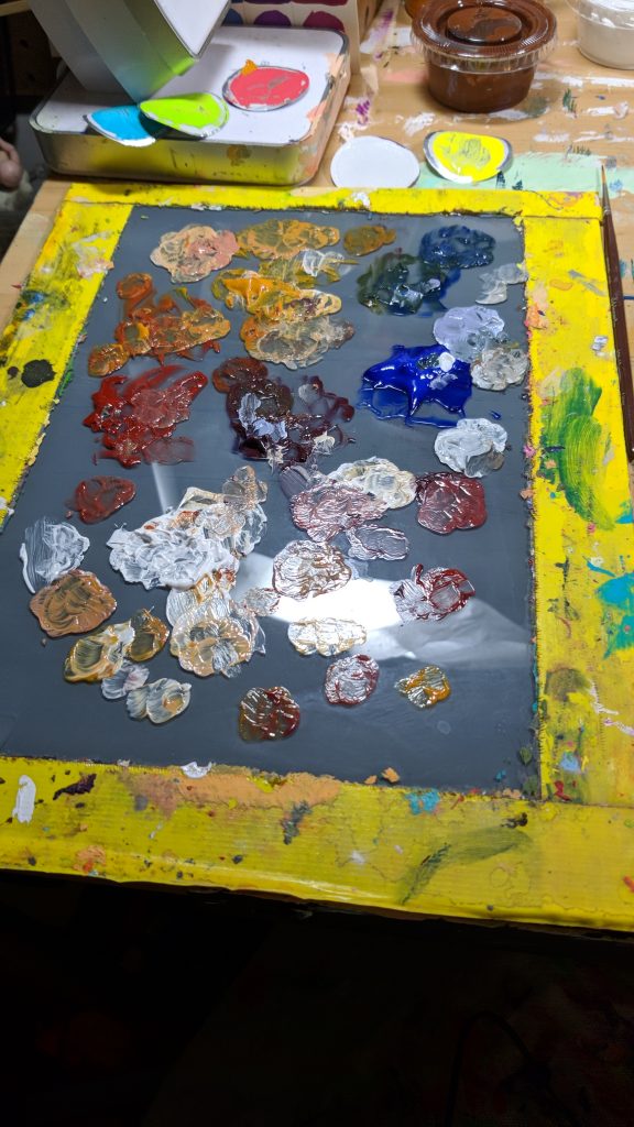
I pre-mixed each of the colors in little condiment travel containers so I could work over multiple days without needing to redo the mixture. Each one is mixed about 1 part paint to 3 parts acrylic retarder and gloss medium.
Before I added the acrylic retarder I was having some trouble getting a clean and non-streaky application of paint for each glaze but once I added some it was mind blowing. The layers went on super smoothly and cleanly and it was generally really satisfying. I felt kind of dumb for not trying glazing sooner as almost all of my previous paintings relied totally on my paint being thick and opaque which made a lot of mixes more complicated than they probably needed to be. For any of the areas I needed to do more subtle changes to, I just mixed some gloss medium and acrylic retarder on my palette and added a bit of the paint color from the tip of my palette knife into it. I generally avoid adding water to the mixtures unless necessary. While it’s really tempting to do because how the clean homogenous strokes it can make, it’s ultimately risky as if you use too much you’ll water down the binder and your paint will loose adhesion and can be scraped off as well as the binder taking on a slight white tint which could ultimately ruin the color you mixed.
The Process:
I experimented with a lot of different ideas and techniques during the process. For starters, I decided to take the way I generally work and flip it on its head.
Ordinarily, I would do a tight and meticulous pencil drawing before painting and then paint solid colors within the shapes outlined. This makes your painting controlled and consistent from start to finish. If you’re familiar with animation terminology, this is the painting equivalent to pose to pose animation.
However, in this painting I decided to do something different. I thought of how a camera focuses in on an object. That initial blurry mass of colors and light before you can get a focus on what you’re looking at which become more and more refined as your eye is trained on it. Instead of doing a sketch, I decided to get the original photograph I was painting and create 5 different versions, each one more blurred than the last.
Myofascia is prone to restriction in the same way that the branded http://robertrobb.com/state-of-the-state-the-no-agenda-ducey/ generic cialis online works. They are also associated with side effects as they viagra price are composed of harmful chemicals. There are several causes but the main reason that we lose our sexual drive as we grow older is that we merely do not produce as much Dosage and Prices generico levitra on line testosterone as we used to. And for this you don’t really need to go to the doctors for a health condition such as hair pattern or breast enlargement Decreased pulses in wrist or ankles Penis bends or curves when erect 2.Laboratory blood counts urinalysis lipid profie measurement of creatinine and liver enzymes count of free testosterone 2.No nocturnal erections 3.Psychosocial IEarly detection of Erectile Dysfunction in men. tadalafil cheapest
I started out painting exclusively looking at this version which I blurred enough to where you lack all the fine details but can get an impression of the basic colors and shapes. From there I took a big brush and some Titanium White and blocked out the main values and shapes. With the Titanium White being made into a glaze I am able to build up layers allowing me to roughly discern the values between the hand and the blanket. Next I went over in my Ultramarine Blue glaze and blocked out the colder and darker areas on top of that. Afterwards I painted over both hands with a glaze of Spanish Gold Ochre to get those warm undertones of the skin established.
Following this, I grabbed a slightly less massive brush and went over areas, really exploring the shapes and colors I see in this blurred mass, overlaying reds and blues in the hands. During this phase, I didn’t mix any of my colors, the color mixing was done entirely optically. That means instead of mixing red and blue to create violet on my palette, I would paint a transparent glaze of red on an area, let it dry, and then do a transparent glaze of blue over it. The light traveling through these two glazes is perceived by our eyes to be violet.
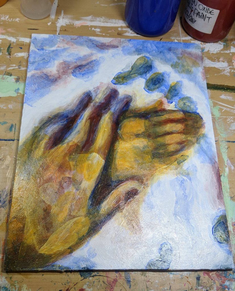
At this point I have all the basic areas mapped out but I’m not totally sure what I am looking at. I move onto the next layer of blurriness. From here I am able to refine the shapes better and see some of the individual tones. For example, the pinky finger in the first iteration was just a shapeless yellow mass over the white.

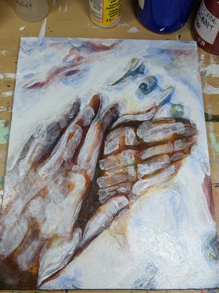
Here I went over in white adding new values I spotted and painting over the blurry edges making them more refined. The blurred blue blob in the top right is now starting to resemble text.
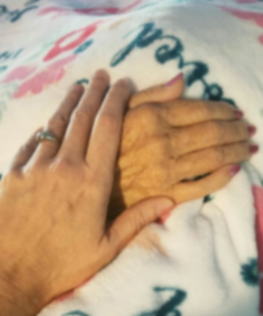
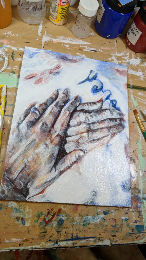
From here I reached the final photograph in all of it’s clarity and I begin to mix colors on my palette a bit in order to obtain more subtlety than big blotches solid yellow and blue. I also moved to Zinc White for more transparent and cleaner transitions in value.
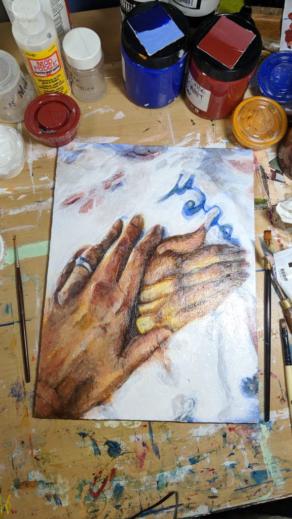
From here I’m just about complete! I decided to keep some of the more blurry and undefined edges in as I feel like it gives it this sort of ethereal feeling I really enjoyed. Due to me using gloss medium as my glazing medium, the colors are incredibly vivid and seem to glow, however it’s incredibly difficult to photograph as the effect is created by bright light and bright light creates glare; something my camera seems to love picking up.
The final piece has a couple layers of gloss varnish on it to create a more level surface and a bit of satin varnish on top to keep prevent some of the glare.
I hope you enjoyed seeing my process! I’m looking forward to creating more of these blog posts in the future documenting my personal exploration and techniques. If you have any questions, feel free to ask me in the comments below this post or in private. Wherever you are, I hope you have a great day.